Deciphering the Dynamic Duo: The Story Behind the DK Logo Design
In the world of graphic design, logos serve as the visual cornerstone of a brand's identity, encapsulating its essence and values in a single symbol. Recently, I had the pleasure of crafting a logo that merges two iconic letters of the English alphabet: D and K. In this article, I'll delve into the creative process behind the conception of the DK logo, exploring the reasons behind its design and its intended purpose.
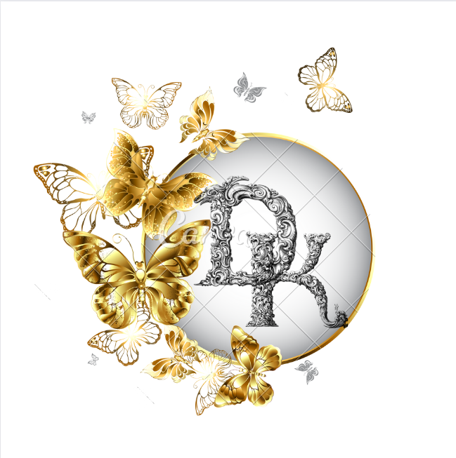
Symbolism of D and K:
The choice of using the letters D and K was deliberate and meaningful. Each letter carries its own unique symbolism, and when combined, they create a harmonious interplay of forms. "D" stands for dynamics, diversity, and distinction, embodying the progressive nature of the brand. On the other hand, "K" represents knowledge, innovation, and kinship, reflecting commitment to expertise and collaboration. Together, they form a powerful synergy.
Visual Aesthetics:
Beyond their symbolic significance, the letters D and K possess visually appealing shapes that lend themselves well to creative manipulation. By merging these letters, I aimed to create a visually captivating logo that is both elegant and distinctive. The gold butterfly create balance and a sense for the love of nature
In crafting the DK logo, I sought to create more than just a visual symbol. Through the seamless integration of the letters D and K, I strived to convey a message of dynamism, knowledge, and
Congratulations @okaforprecious! You have completed the following achievement on the Hive blockchain And have been rewarded with New badge(s)
Your next target is to reach 20 posts.
You can view your badges on your board and compare yourself to others in the Ranking
If you no longer want to receive notifications, reply to this comment with the word
STOPCheck out our last posts: