Hive-Engine Got a Hot New Makeover
frens, often times website redesigns are overlooked as something small. To me, it's a very important part of a good website or application.
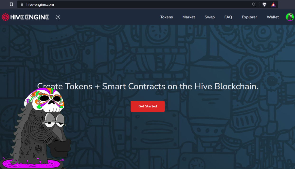

Hive-Engine is kinda sexy now
I don't know about you, but I've been using Hive-Engine for quite some time. I've never been a huge fan of TribalDEX or LeoDEX to be honest. BeeSwap is probably my all time favorite when it comes to exchanges for Hive Engine tokens. They all have a lot of growing to do still, but for some reason I always find myself using the OG Hive-Engine. Maybe it's because I'm a bit of a minimalist, or maybe it's just because it's simple... But you know, everyone has a preference. I hadn't gotten on there in a couple days as I've been busy but I hopped on to swap some random tokens for some MATIC to use PolyCUB. Turns out I had a few random tokens worth a couple dollars and gas fees on the Polygon chain are very low. Anyway - when I went to the site, I was kinda in shock when I saw that it had defaulted to dark mode. I was expecting the same old white background and minimal design. It was beautiful.
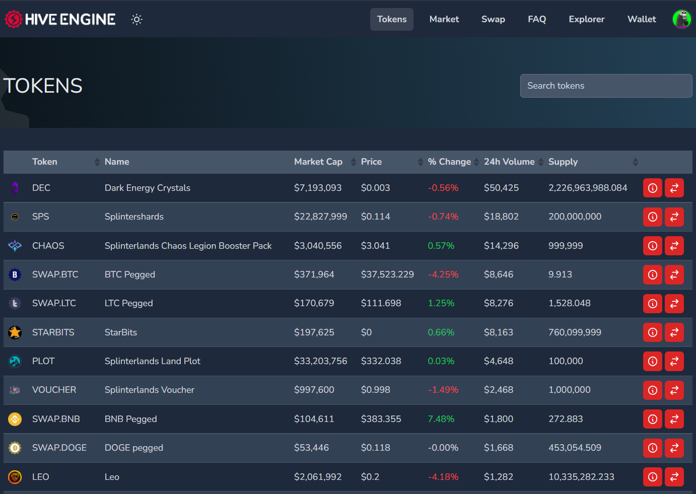
While a lot of the design updates are very small, I'm a stickler for good website design. If I'm going to be on a page for an extended period of time - like crypto trading... I want it to be comfortable. Easy on the eyes. Easy to navigate. The buttons should be clear and easy to recognize. Simple things like that can really keep someone's attention when they land on your website. For example - I love how the buttons are bright red and contrast well with the dark background. There's no searching around for buttons or struggling to see them due to terrible color choice. Come on, you know what I'm talking about. We've all been to a terribly designed website before lol.
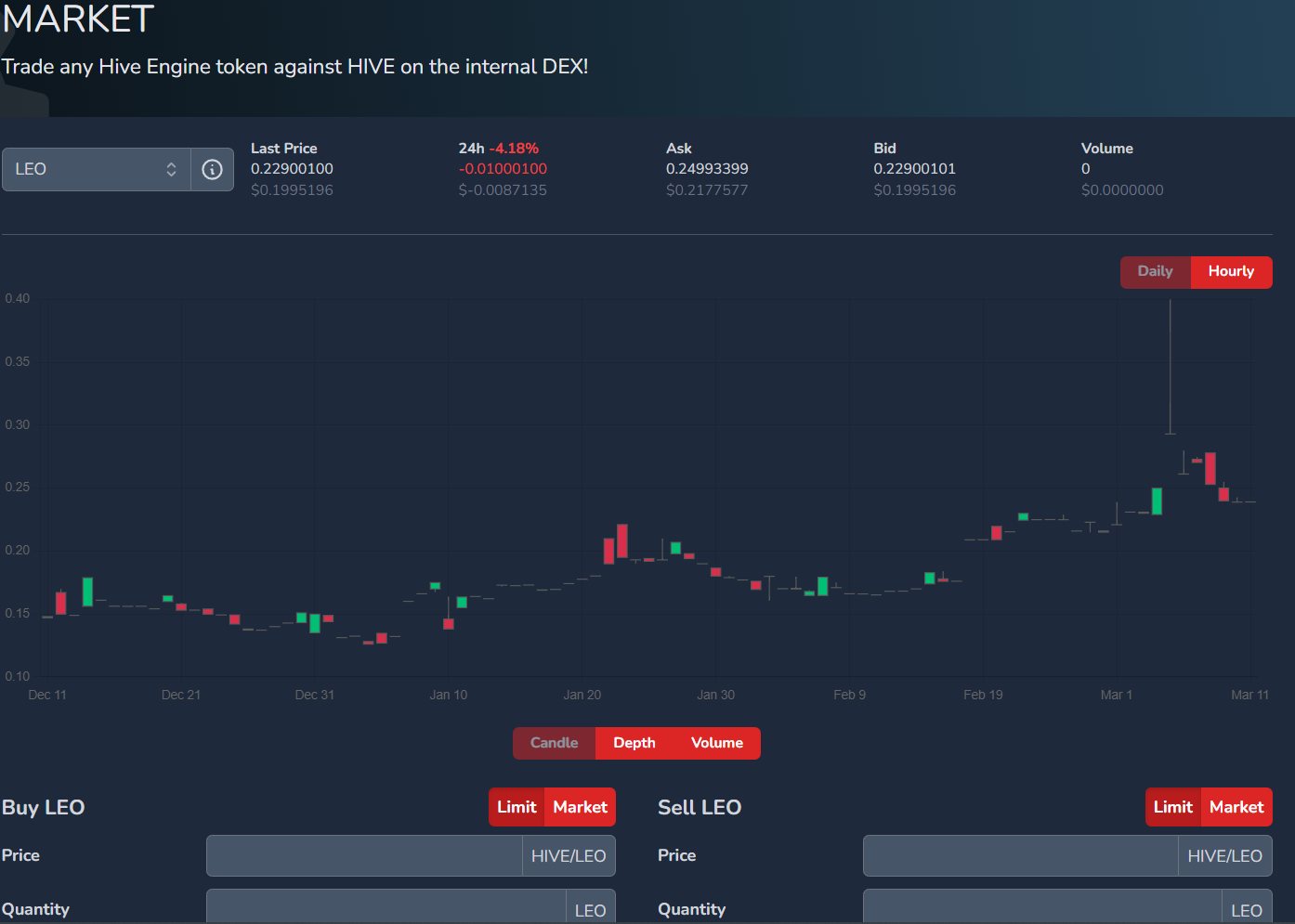
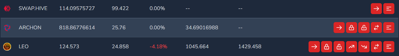
The market page got a little refresh too which is the most important page. My only criticism here is that the green and red candles on the chart should be brighter. Maybe the background a little darker. A little more contrast would be very helpful here coming from someone that hates looking at charts. The colors should contrast very well to make it easier to read the chart. Again - all of these are very subtle changes that actually make a huge impact for the user. I'm no graphics designer or web designer, but I know what is comfortable to my eyes.
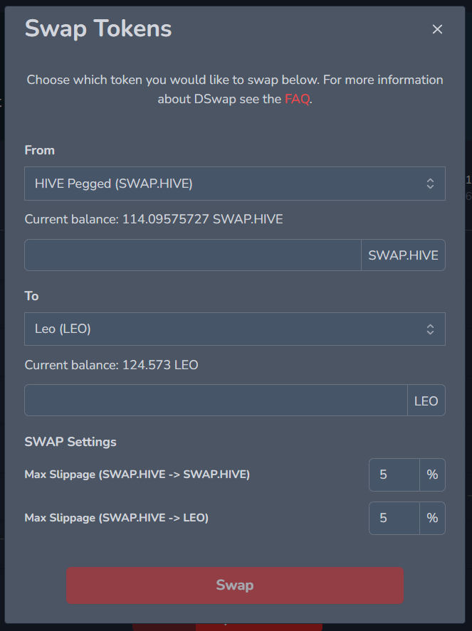
The same thing goes for the Swap window. The background should be a little darker and the words would contrast a lot better. Another greatly underrated feature. Before BeeSwap was a thing, DSwap was something I had used frequently to instantly swap Hive Engine tokens. The buttons are my favorite part. Super bright and easy to read.
Overall, I love the refresh. The colors just need a little tweaking and I'll be super happy with it. Great job to the devs, and thank you for giving a breathe of fresh air to an OG Hive app. My only question is....
wen dark mode on Hive Engine Explorer?
Thanks for reading! Much love.
Links 'n Shit
| Play to Earn | Read emails, Earn Crypto | Get free crypto every day | Get a WAX wallet |
|---|---|---|---|
| Gods Unchained | ListNerds | PipeFlare | WAX.io |
| Splinterlands | GoodDollar | ||
| Rising Star | FoldApp |

Posted Using LeoFinance Beta
yeah, I like the new look and layout. I hope they add the link to Tribaldex back into the site too just to make it easier to click over. I still like using both.
Posted Using LeoFinance Beta
That would be really cool
Posted Using LeoFinance Beta
It looks great and was long over due.
Posted Using LeoFinance Beta
absolutely. such a nice surprise
Posted Using LeoFinance Beta
I have not used Hive engine before is only tribaldex,I have tested once.
Posted Using LeoFinance Beta
Both are great!
Posted Using LeoFinance Beta
Yes
Posted Using LeoFinance Beta
I need to get back on hive engine to try it out ! I only use leodex and beeswap to be honest.
Posted using LeoFinance Mobile
BeeSwap is the best
Posted Using LeoFinance Beta
Do you know what the team's thinking is behind maintaining both the Hive-Engine and Tribaldex front-ends?
Why not just pick one?
Posted Using LeoFinance Beta
No idea buddy. I've thought they would kill Hive-Engine off for a while.
Posted Using LeoFinance Beta
Ooooh. It looks hot, fresh from the oven!
Posted Using LeoFinance Beta
Congratulations @l337m45732! You have completed the following achievement on the Hive blockchain and have been rewarded with new badge(s):
Your next target is to reach 3500 comments.
You can view your badges on your board and compare yourself to others in the Ranking
If you no longer want to receive notifications, reply to this comment with the word
STOPTo support your work, I also upvoted your post!